More disappearing Covid vaccine data
Add British Columbia to the governments trying to hide the reality that the mRNA jabbed make up the vast majority of Covid hospitalizations and deaths.
If at first you don’t succeed, hide the numbers.
Until Thursday, the Canadian province of British Columbia provided a clear breakdown of hospitalizations and deaths by vaccine status. Each week, the BC Centre for Disease Control offered an updated count of vaccinated, boosted, and unvaccinated people who had been hospitalized or died.
British Columbia presented the data in what it called “vax donut charts,” because the charts looked like donuts and were stratified by Covid vaccine status. (Crazy, I know.)
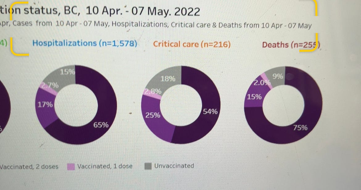
Here’s a vax donut chart from May, for example:
Unfortunately, in the last few months the vax donut charts have become less tasty than vaccine advocates had hoped.
The dark purple color represents people who have received at least three Covid vaccine doses, and the purple color those who have received two. As the charts make clear, vaccinated and boosted people account for the vast majority of all Covid hospitalizations and deaths in British Columbia.
—
(SUBSCRIBE NOW! Or later. But I’d rather NOW.)
—
By way of comparison, just over half of all of British Columbia’s 5.3 million residents are boosted, while another 31 percent have received at least two doses. Yes, vaccinated and especially boosted people tend to be somewhat older than the unvaccinated.
Still, the fact that 75 to 80 percent of all deaths occur in boosted people highlight the sad reality that the shots do little if anything to stop severe cases and death from Omicron - the final defense of vaccine advocates.
And so British Columbia announced last week that the Vax Donut Chart would be no more. “As of July 28, the Outcomes by Vax and Vax Donut Charts have been retired,” a notice on the Centre for Disease Control Website said blandly.
Retired! Orwell would be proud.
Worse, the charts from earlier weeks also seem to have disappeared from the Wayback Machine - the Internet’s most crucial archive. Trying to find them on saved pages simply pulls up the July 28th notice.
Amazingly, a Canadian television network actually asked the Centre for Disease Control why it had pulled the charts. The agency’s response:
“As most of the population has now been vaccinated with at least two doses of vaccine and many more have been infected with COVID-19, the data became hard to interpret."
The data became hard to interpret.
And by “hard” they mean “easy.”


Charts? Graphs?
LOOK AROUND! Everyone knows people who've been victimized by this garbage.
So many people won't admit that they screwed up by rolling up their sleeves.
And Brandon is positive again. Have another booster, you demented old fart!
Imagine if just 50% of radical “mainstream” media did follow up reporting on this mRNA genocide. I hope Trump or DeSantis just ends the CDC on Jan 20, 2025.